
 Jerry
Garage Redesign
Transformed Garage from a fragmented set of tools into a cohesive ecosystem, unlocking higher engagement, stronger retention, and new monetization pathways.
- Timeline
- 2025
- Duration
- 6 months
- Team
- Me, 2 PMs, 1 data scientist
- Role
- Lead Product Designer
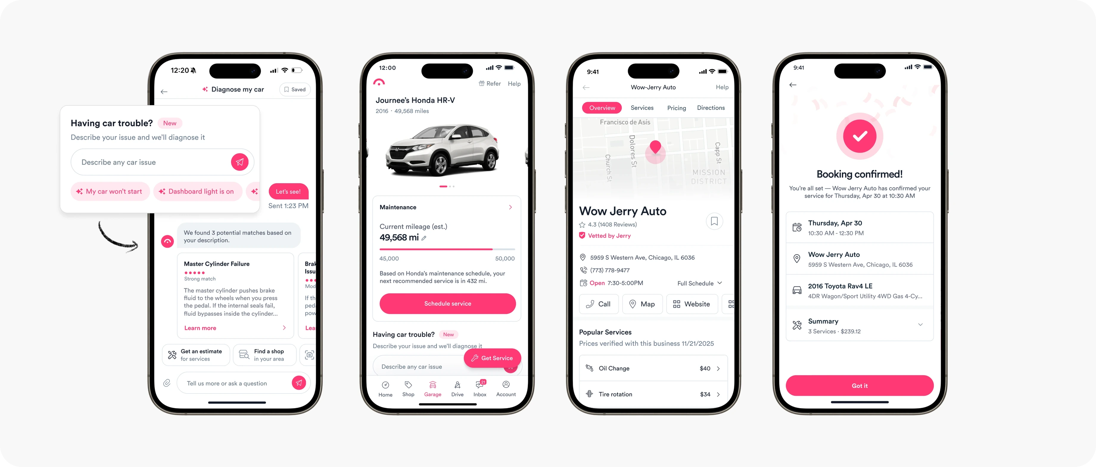
Overview
My role
- Built or redesigned 8+ major features in 6 months
- Launched Jerry’s first consumer-facing LLM product
- Developed a framework to inform prioritization and drive cross-feature adoption
Impact
- 90.1% increase in product engagement (active sessions)
- 50.3% increase in Month 1 retention
- Drove low-CAC growth: 36K new users through new low-cost funnels in the first 2 months
Garage was one of Jerry’s core consumer products in the native mobile app, a collection of tools for maintaining, repairing, and managing your car. But years of focus on growth and insurance conversion had left the product stale, fragmented, and underperforming.
As Jerry’s strategy shifted toward higher-frequency car ownership use cases — giving users more reasons to return and extending the window for policy conversion — Garage emerged as one of our highest-leverage opportunities.
Over six months, my team overhauled the product, transforming a disjointed set of dead-end features into a cohesive product suite designed to support users across the car ownership journey. In the process, we rearchitected the core experience, redesigned existing features, and built new ones to address gaps in the journey — including Jerry’s first consumer-facing conversational AI product.
Problem
Jerry’s core business is as an insurance marketplace, but a long sales cycle + low engagement meant many customers were churning before purchase.
Long sales cycle
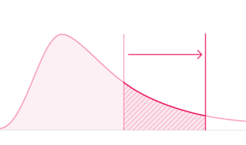
Car insurance is a low-frequency, high-consideration purchase — most users shop in a narrow window before renewal, then go dormant. Some convert quickly, but there was a long tail: the longer users stayed engaged, the more likely we were to convert.
Low engagement, poor retention
Jerry had a retention problem: outside of active insurance shopping, there was little reason to stick around — and many users churned long before they were ready to buy.
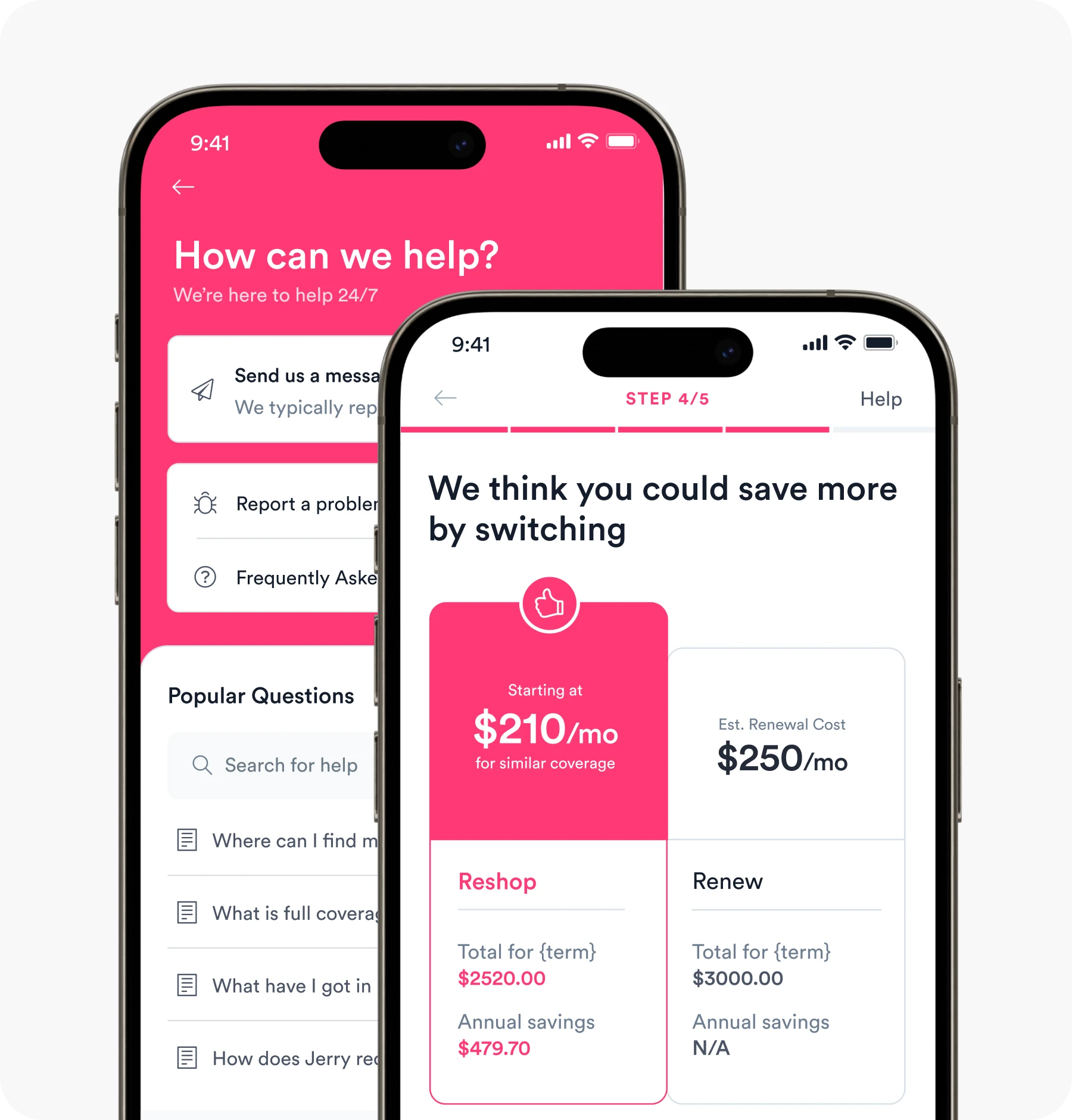
Strategy
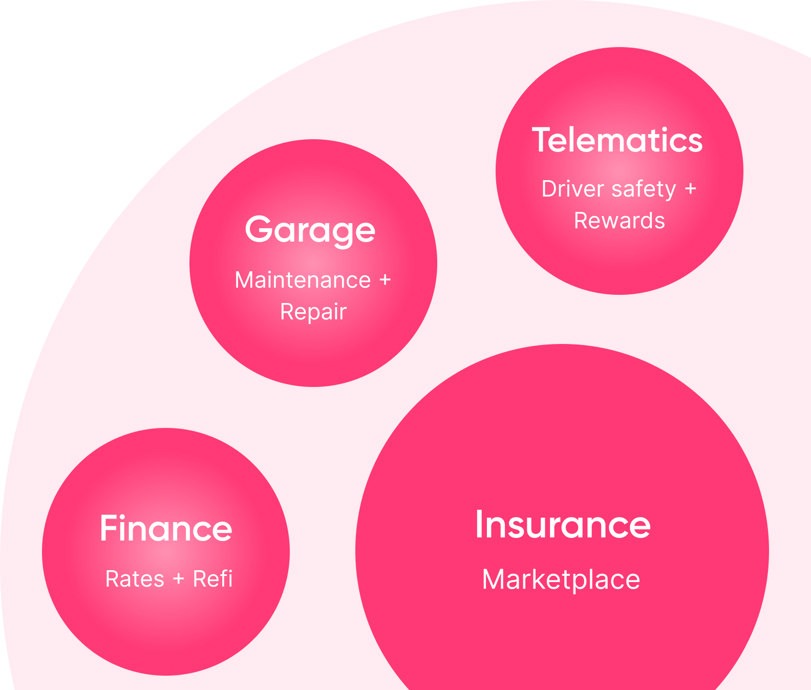
To sustain engagement and extend the time horizon for policy conversion, our strategy shifted towards building an ecosystem of utilities for car owners.
Focus on higher-frequency use cases
Expand beyond episodic insurance shopping into utilities users return to regularly → extend the window for conversion and capture more of the long tail.
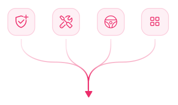
Build bridges — not islands
Integration was the force multiplier: features that plug into one another drive discovery, adoption, and become a flywheel for engagement.
Optimize for learning speed and iteration
Ship, measure, and refine quickly — doubling down on concepts that showed real user and growth signal.
Capture more of the long tail
Engagement between insurance touchpoints extends the window for conversion, so we keep the users we don’t close right away.
Acquire users for less
Insurance advertising is expensive and competitive. Maintenance, repair and safety are far cheaper to acquire for, and people who come for one often convert to the other.
Design
Garage, Jerry’s maintenance and repair product, was the highest-leverage part of the AllCar strategy. My team was tasked with overhauling all of it.
A legacy product that had historically been underinvested in: a fragmented collection of bells and whistles, each vaguely useful on its own, built in silos, not talking to one another even in the ways you’d expect.
Product vision
Transform Garage from a fragmented set of tools into a cohesive product suite.
Scope + Prioritization
Realizing the vision meant overhauling existing features while building new ones to fill gaps across the broader car ownership journey. Over six months, we touched nearly every part of Garage — from diagnosing a problem to finding a shop and booking a repair.
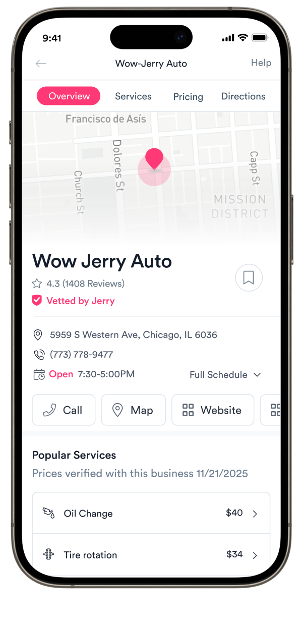
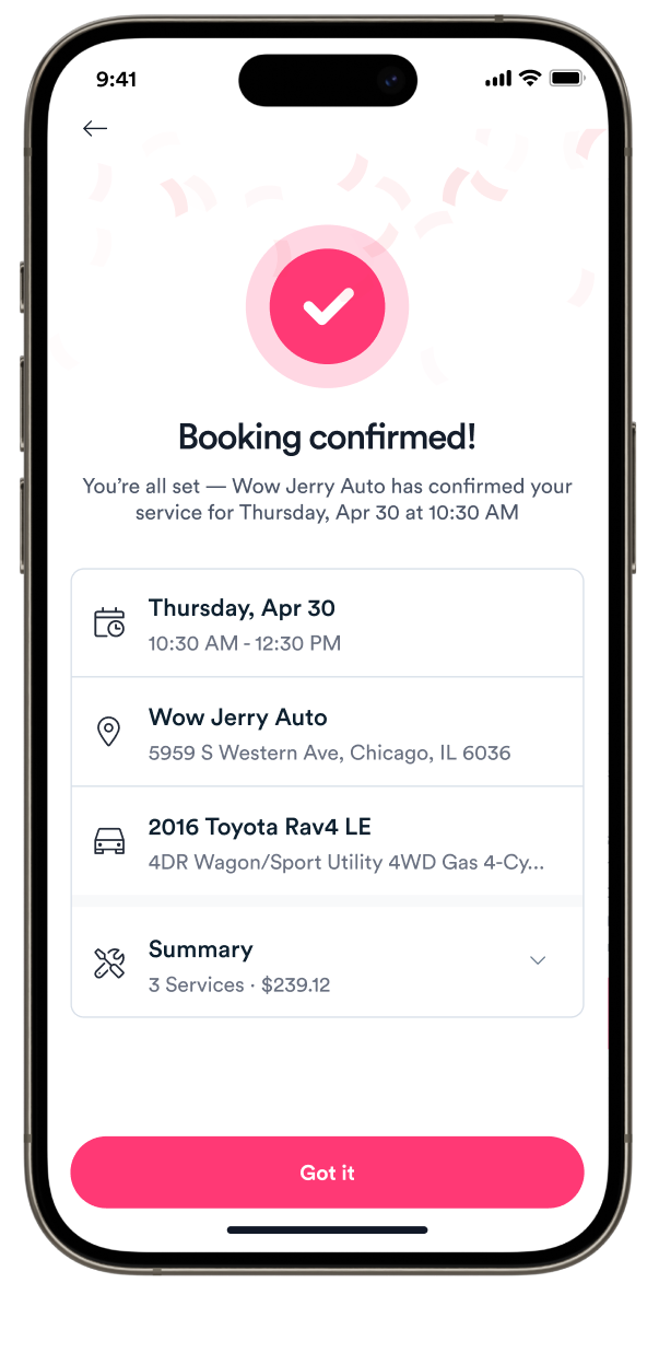
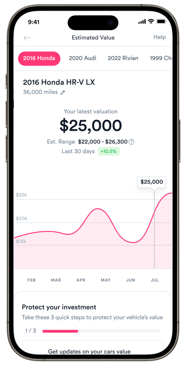
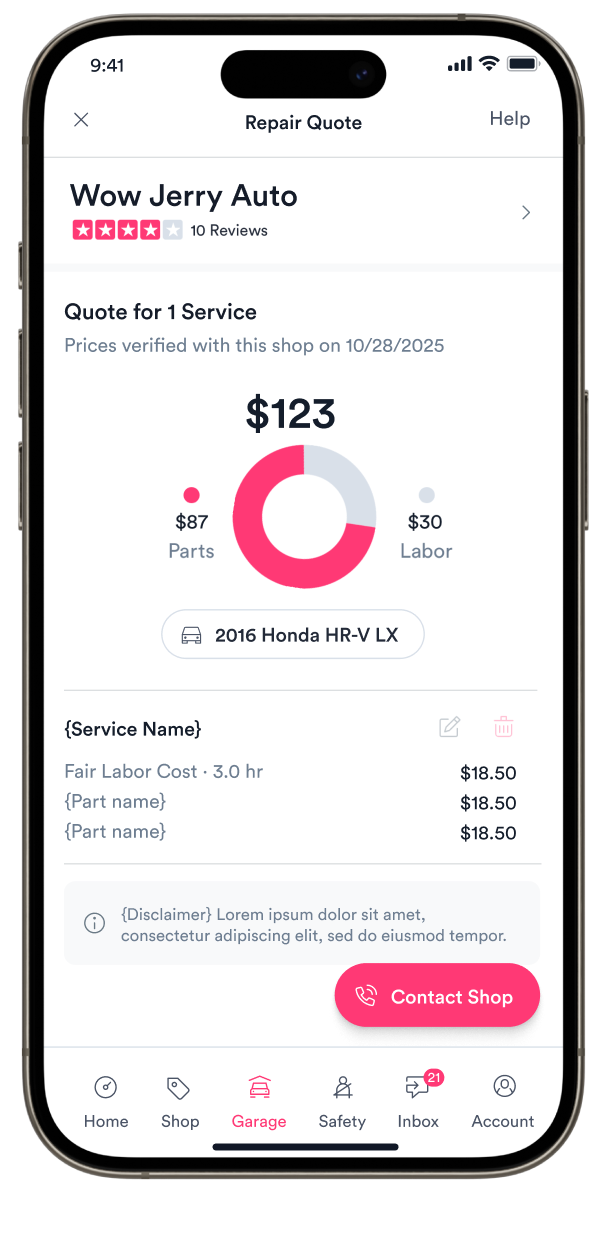
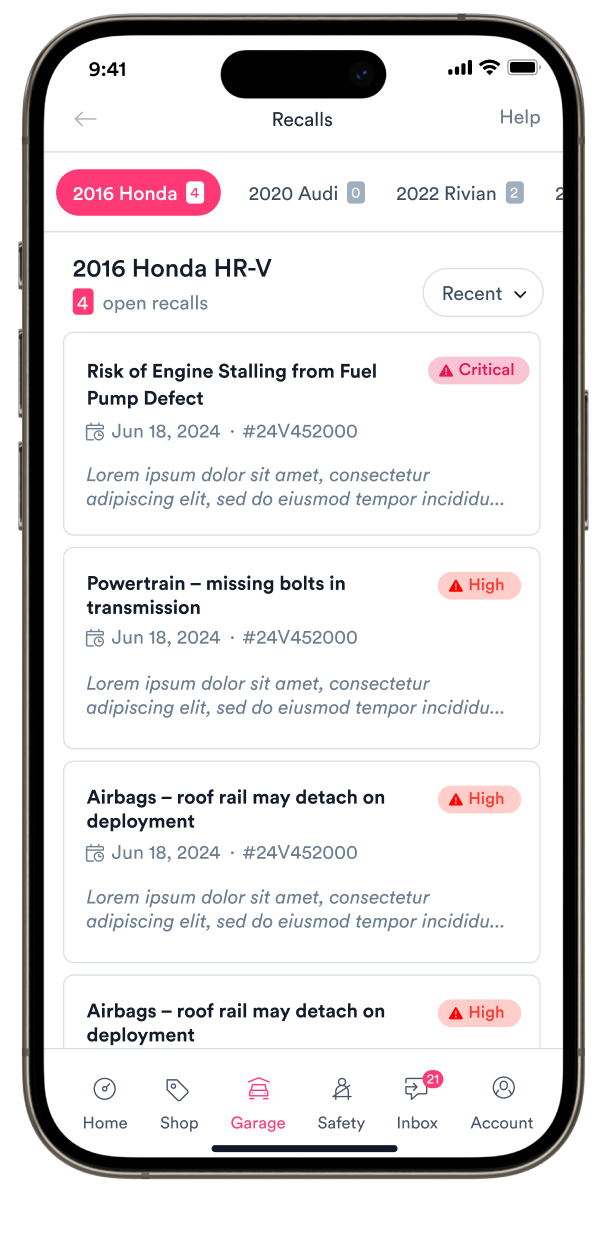
The opportunity space was broad, so prioritization mattered. We weighed engagement and funnel metrics, what we were hearing through discovery, and where each opportunity sat within the broader journey.
That last piece became particularly important: connecting features that had been built in isolation could make each one more useful, while creating natural paths into the rest of Garage.
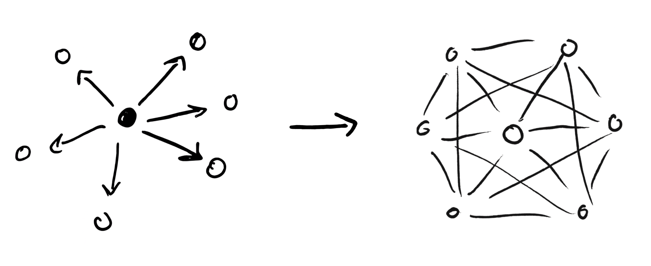
“Theory of Everything”: a framework for integration
Garage had become surprisingly hard to reason about as a system. Features had been built in isolation, with overlapping concepts and no shared model for how the pieces fit together.
I started mapping the system for myself, and eventually realized that much of the complexity boiled down to the same handful of building blocks. A diagnosis could feed an estimate. An estimate could feed Shop Search. Add a shop and a time, and those pieces could become a scheduled service.
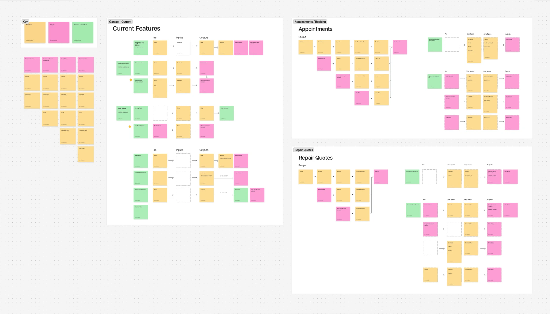
What started as a way for me to untangle the system became a shared framework for the team. We used it in working sessions and PRDs to map what existed, spot missing connections, and reason in both directions: Where else could this output take someone? What would this new feature need as an input?
It also gave us another way to think about sequencing — helping us prioritize upstream features like Diagnose that could serve as jumping-off points into the rest of Garage, while working backward to find natural points of entry for new capabilities like appointment booking.
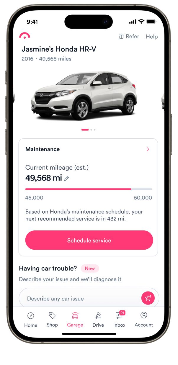
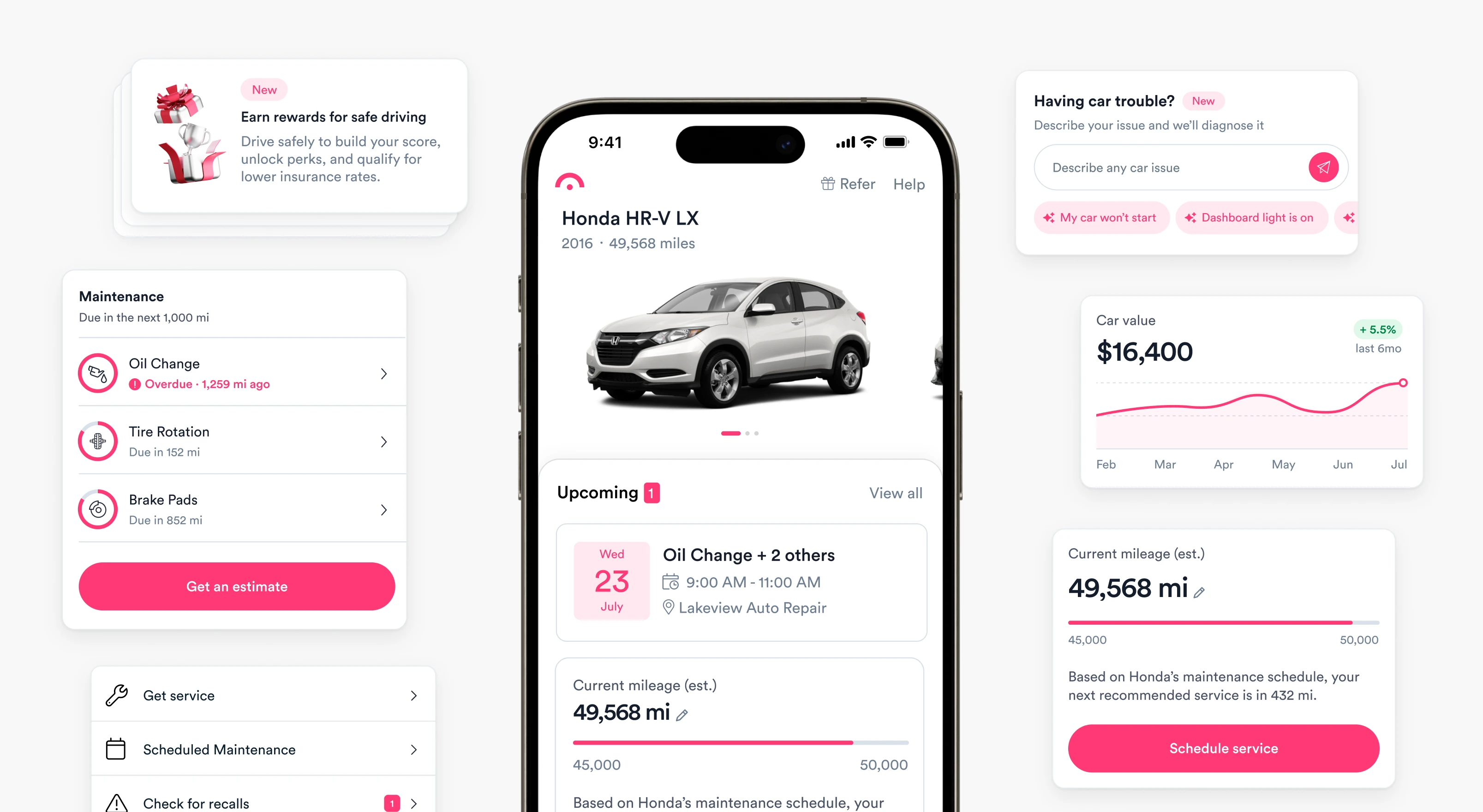
Putting the car at the center
Garage had been organized around tools rather than the vehicles people used them for. We reworked the architecture around each car, turning a collection of generic entry points into a more useful dashboard that surfaced relevant information upfront and made the rest of Garage easier to discover.
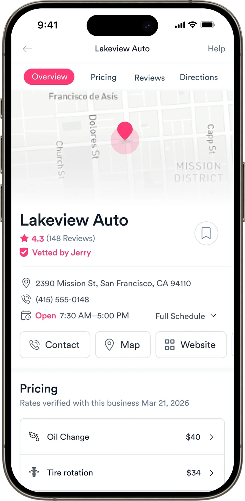
Strengthening a load-bearing feature
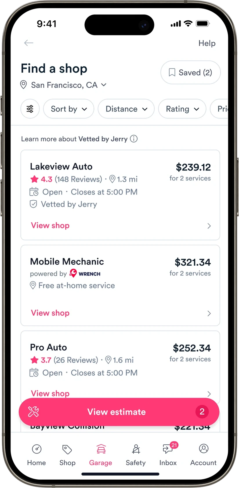
Shop Search was overdue for an overhaul, but its importance went well beyond the standalone experience. Shop discovery served as connective tissue across Garage, with many user journeys running through it. We redesigned search, shop details, and shared components to improve the experience itself and strengthen the infrastructure other tools depended on.
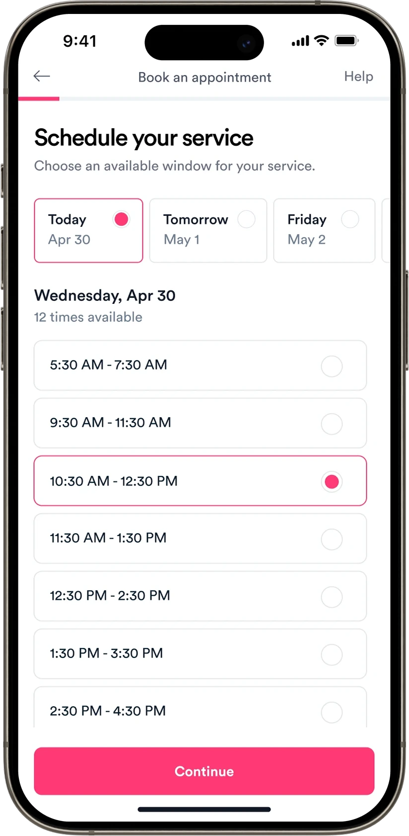
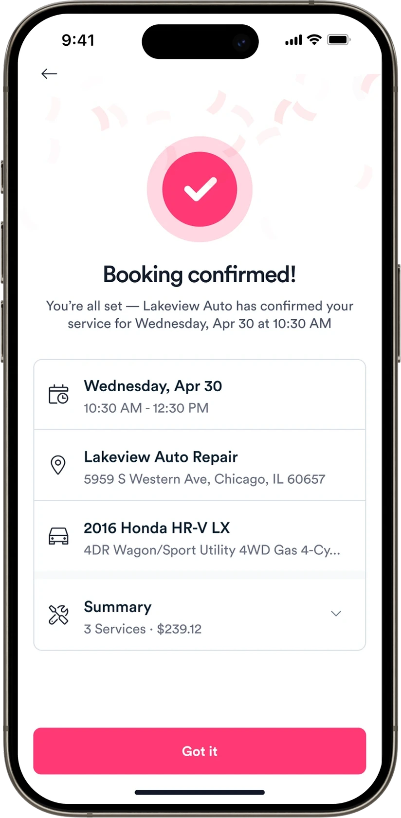
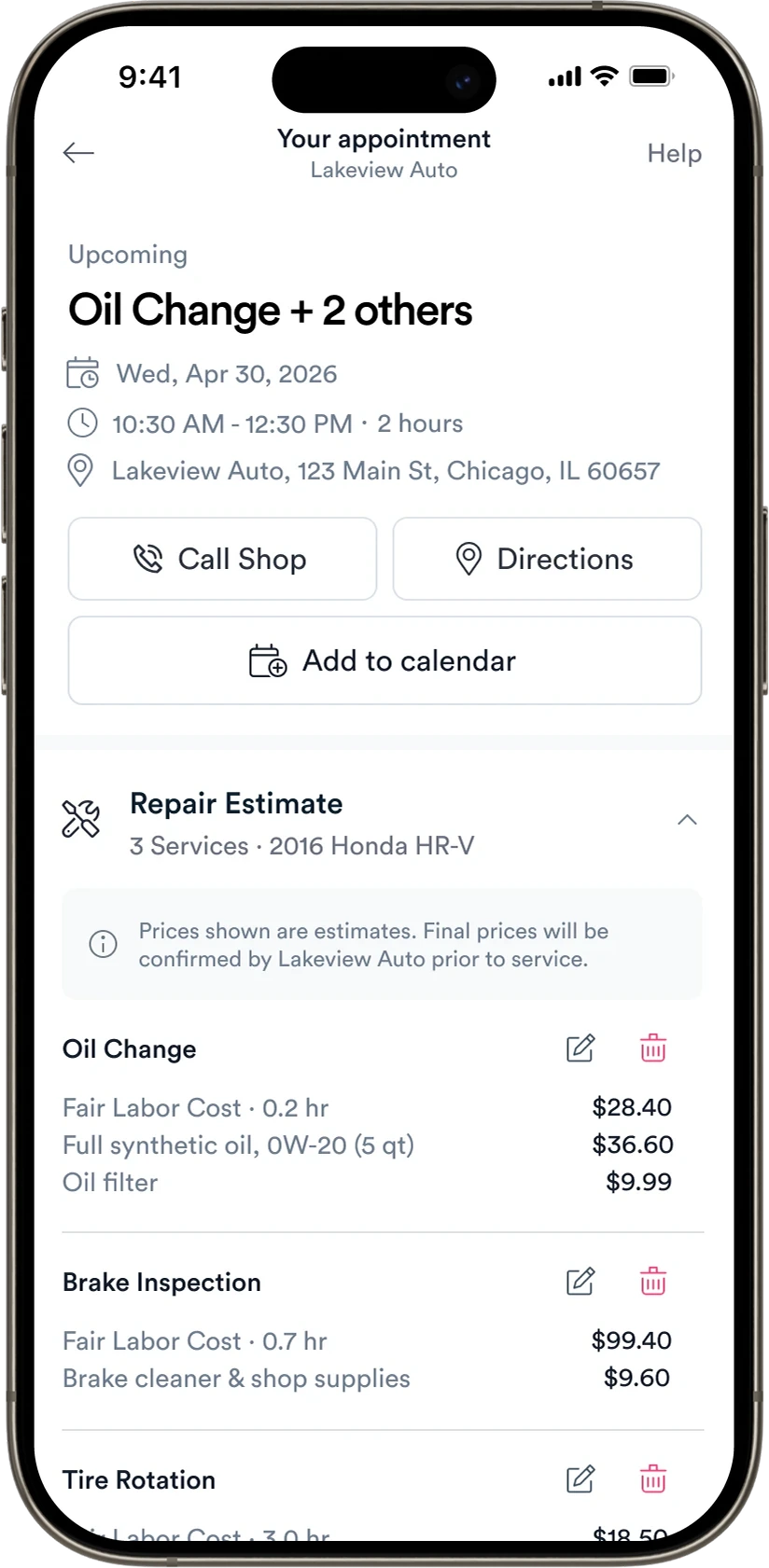
Closing the loop on service
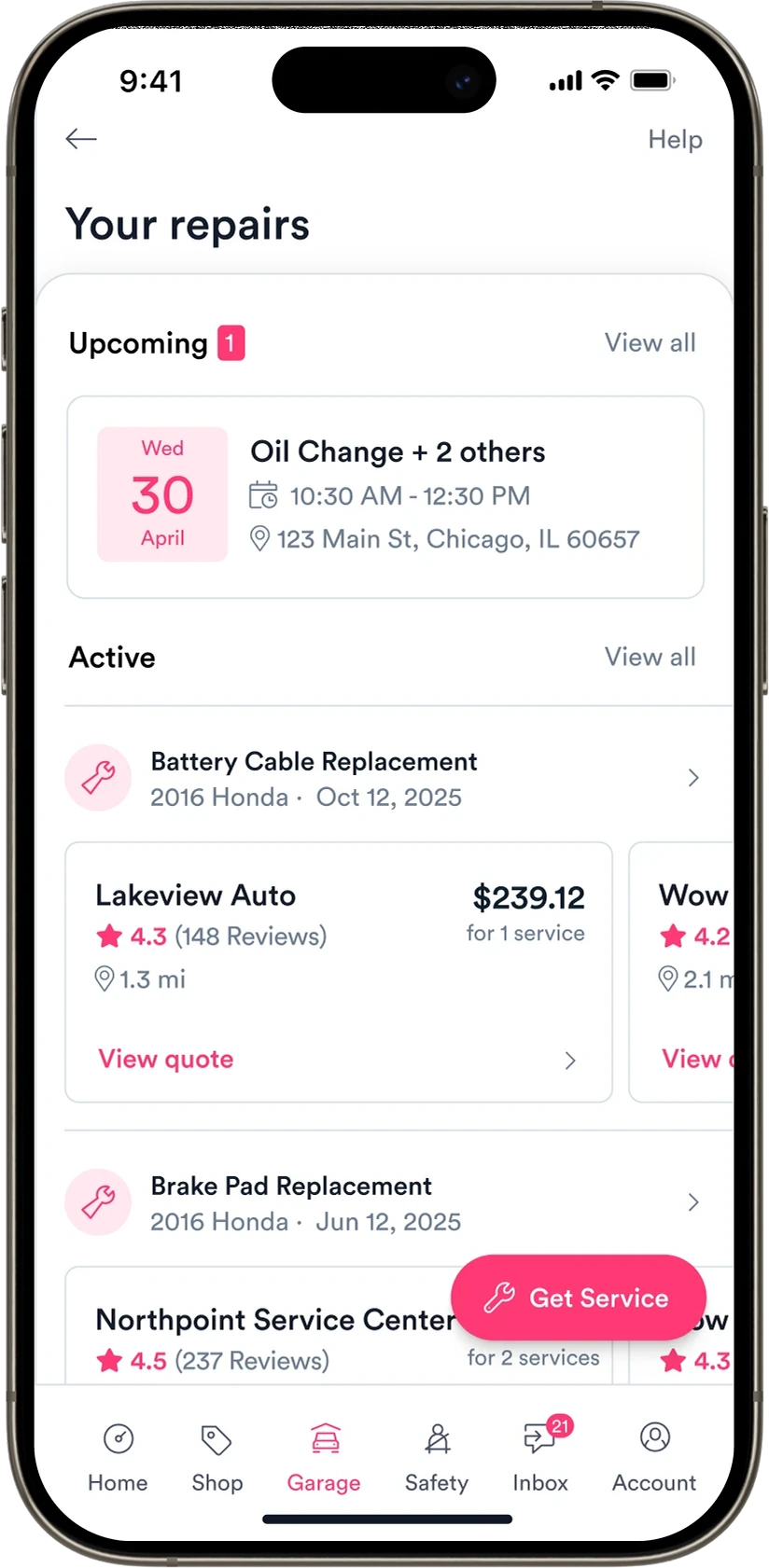
Garage could help users diagnose a problem, estimate the cost, and find a shop, but that’s where the journey ended. We introduced appointment scheduling to close that gap, giving users a way to book the service they needed without leaving the app.
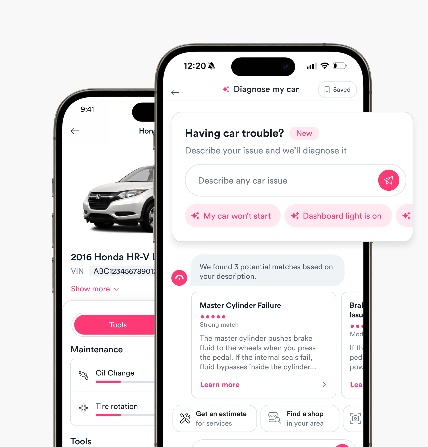
A natural on-ramp to the broader product ecosystem
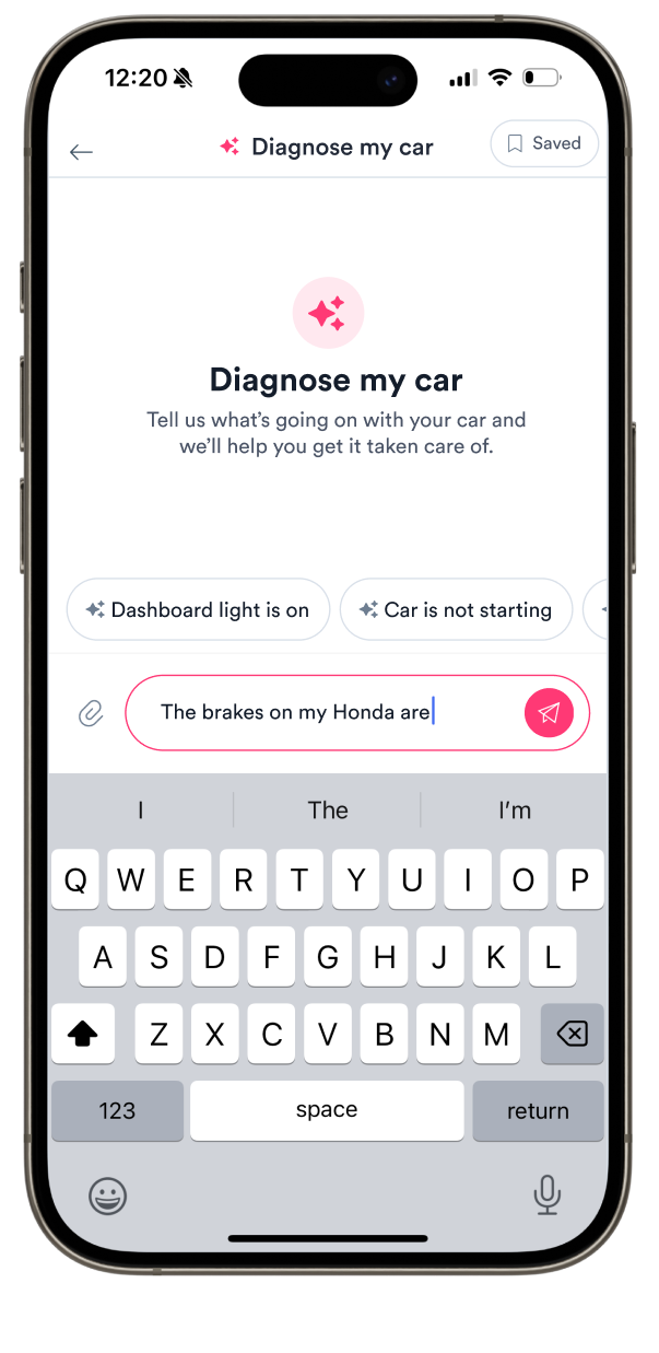
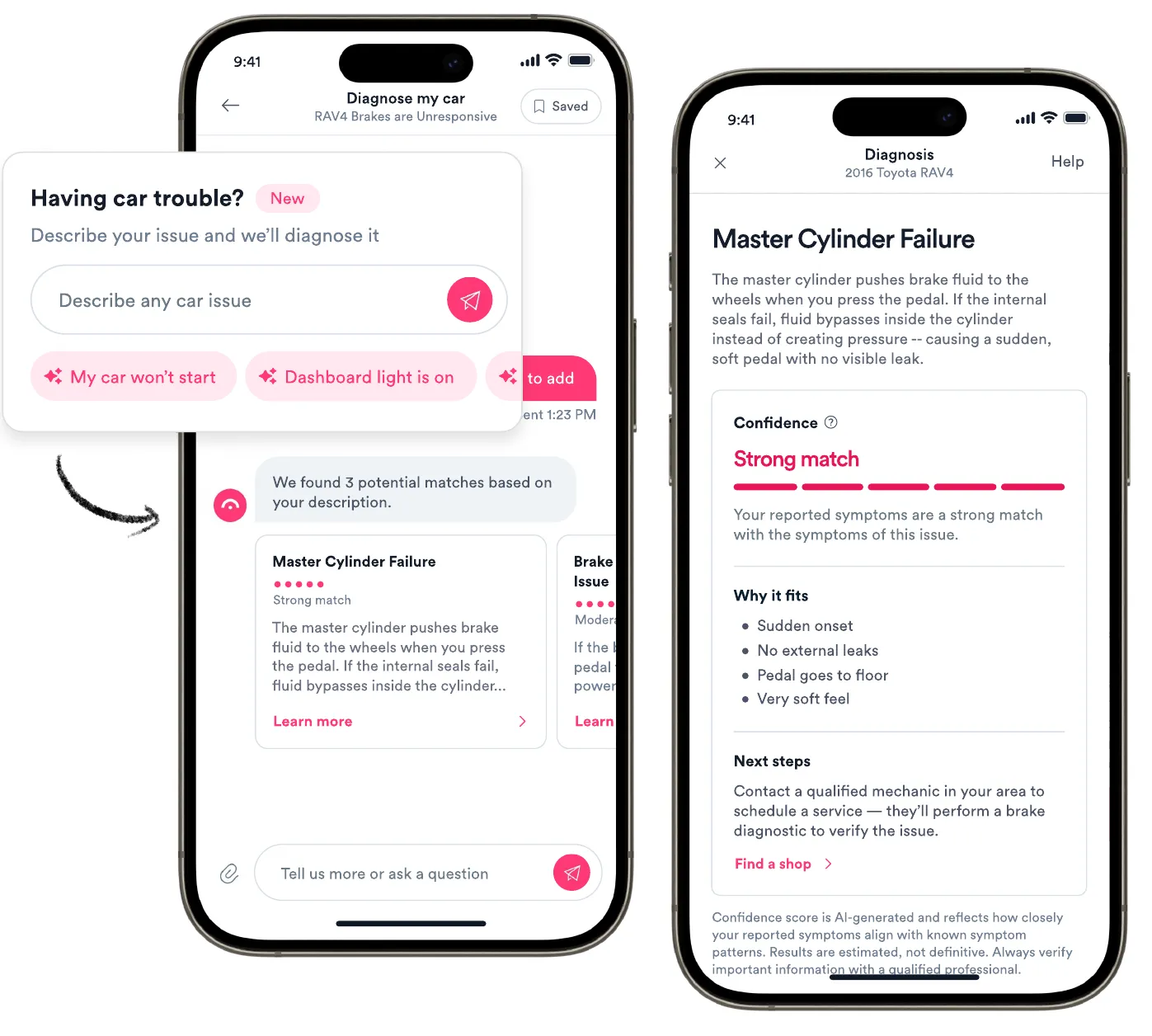
Diagnose was designed as a conversational experience that let drivers describe car trouble in their own words, using adaptive follow-ups to narrow down likely causes. We built next steps directly into the experience, carrying that context into repair estimates and shop discovery so users could act on their diagnosis without repeating themselves.
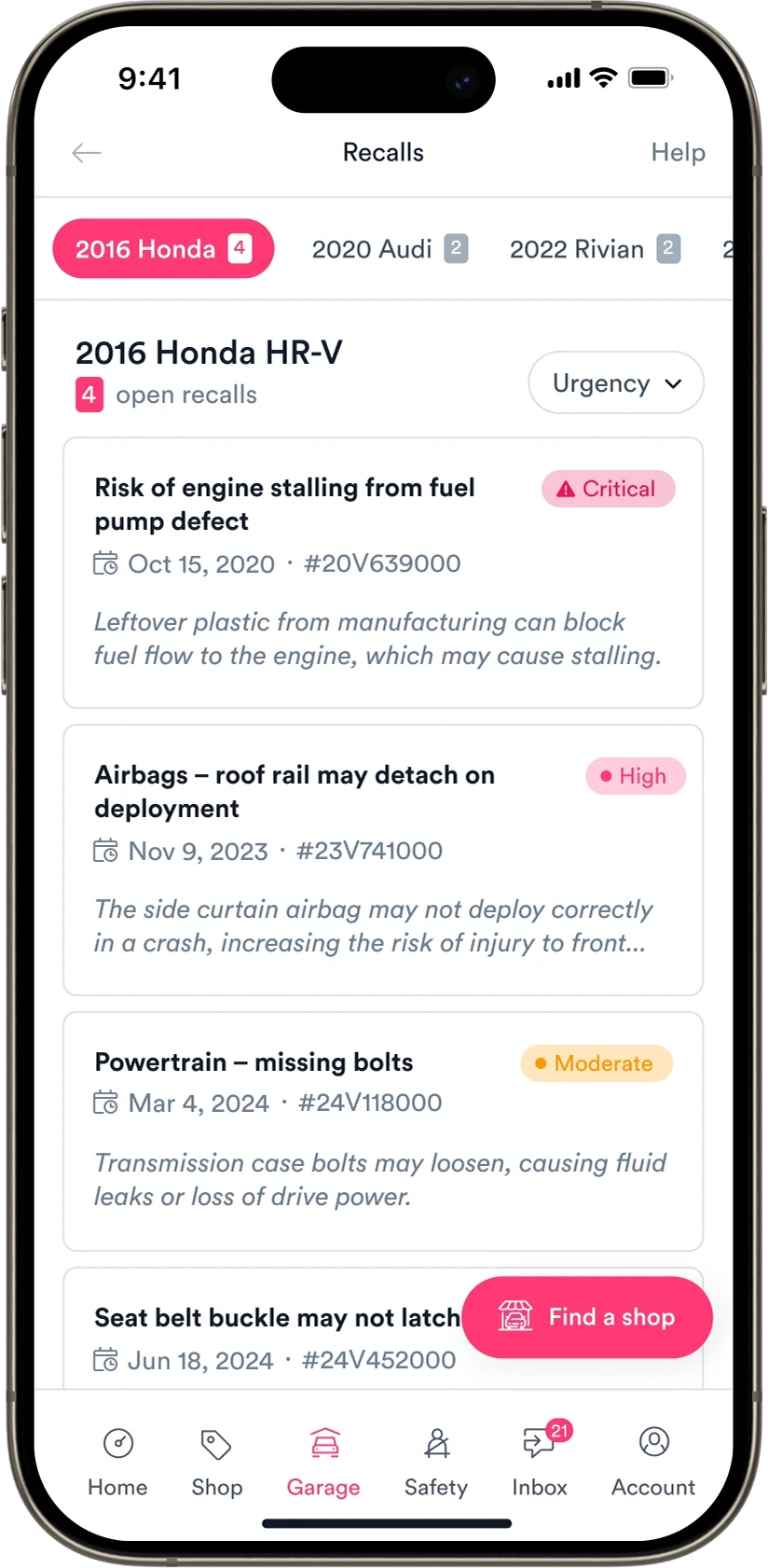
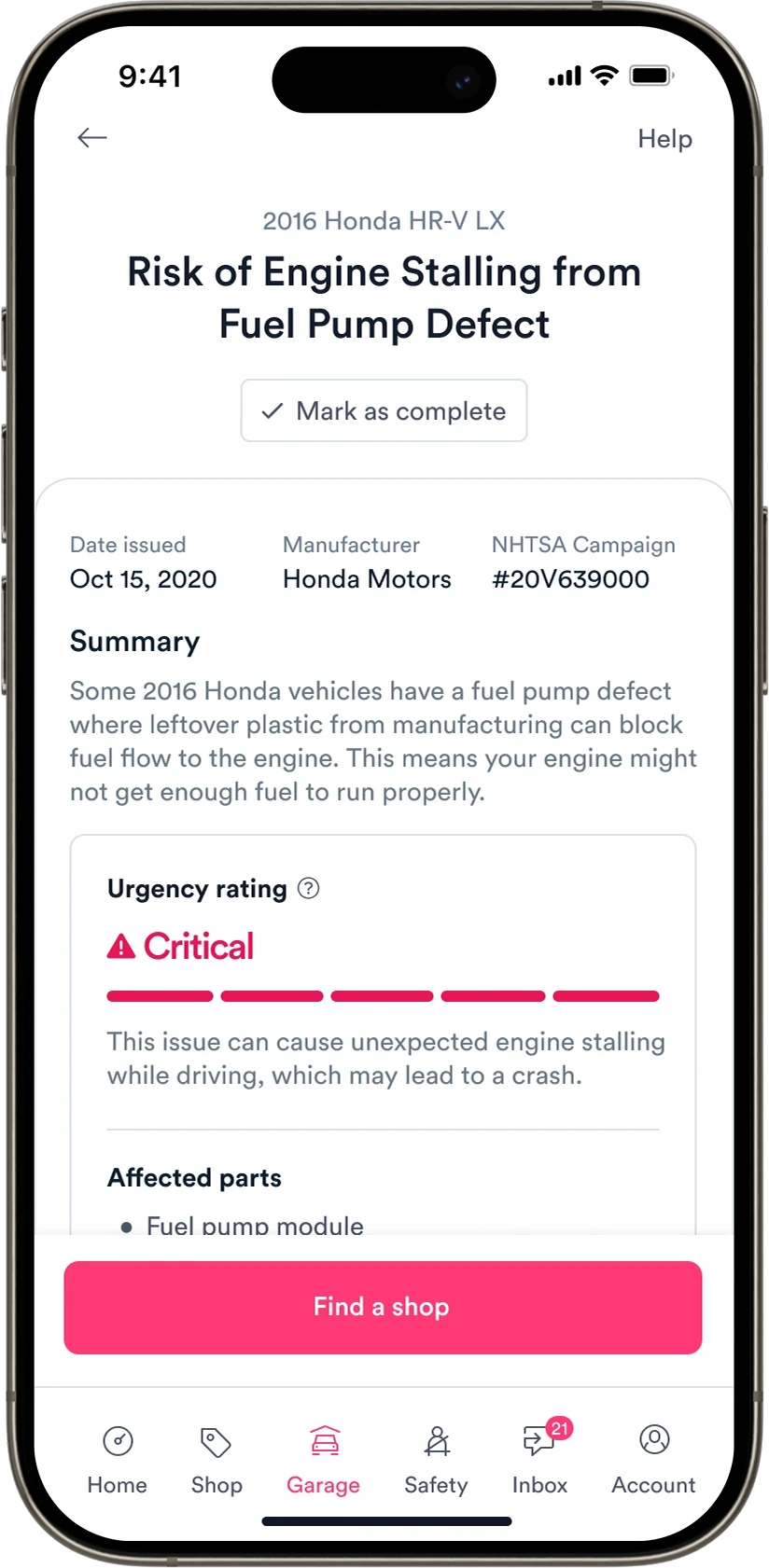
Lasting engagement from a moment of high intent
Recalls was a particularly effective acquisition channel, bringing users in with an immediate, meaningful concern—and often surfacing recalls they didn’t know they had. We overhauled the experience with clearer, more actionable guidance, ongoing monitoring, and direct paths into shop discovery, addressing the immediate need while creating opportunities for longer-term engagement across Garage.
Long-term value from a one-time valuation
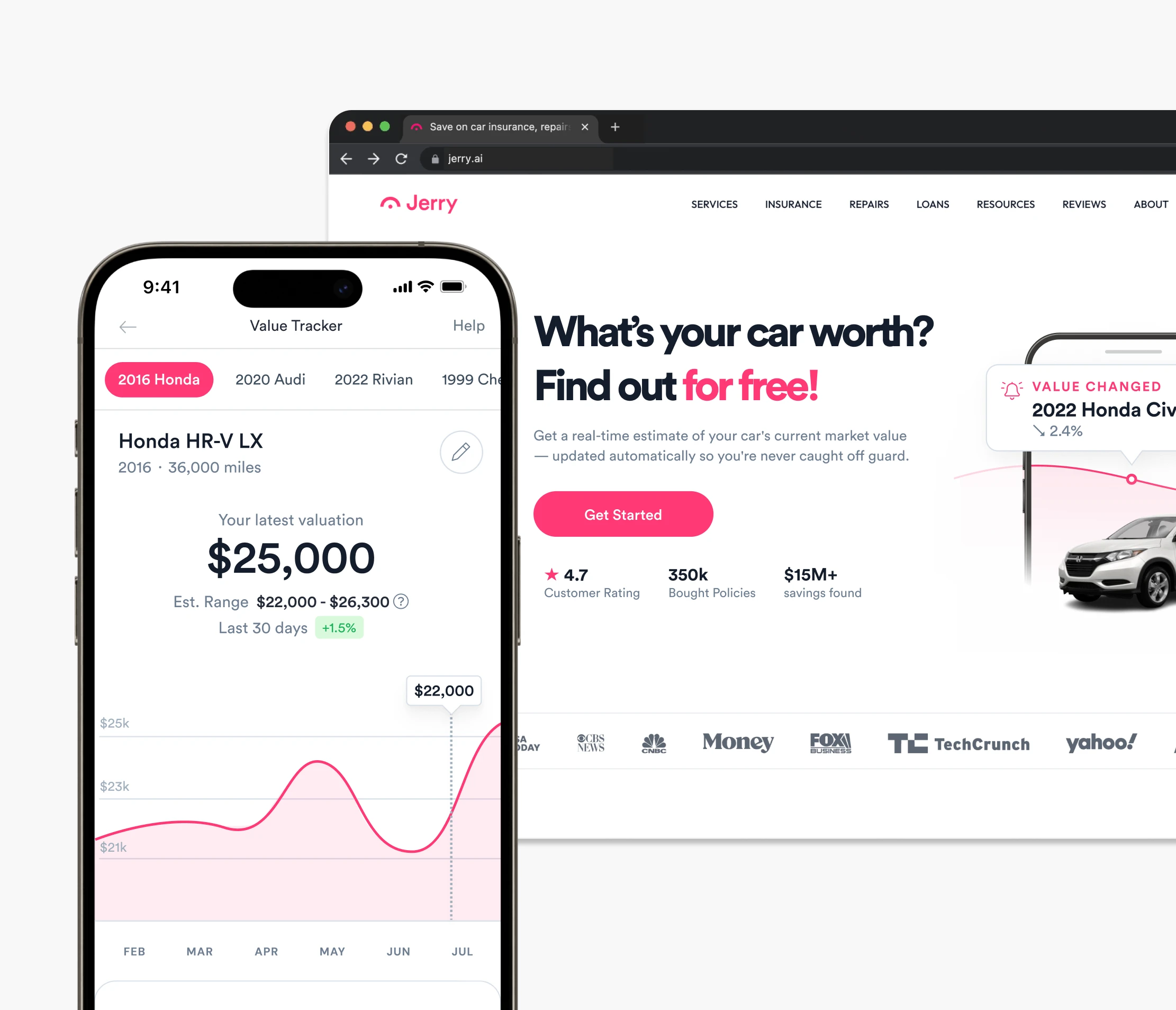
Value Tracking was an effective acquisition hook, tapping into people’s curiosity about what their cars were worth. The challenge was extending that value beyond a one-time check. We used the framing of protecting their investment to encourage maintenance tracking, notifications, and insurance shopping—driving adoption of other Garage tools and longer-term engagement.
Deep dive
Diagnose my car
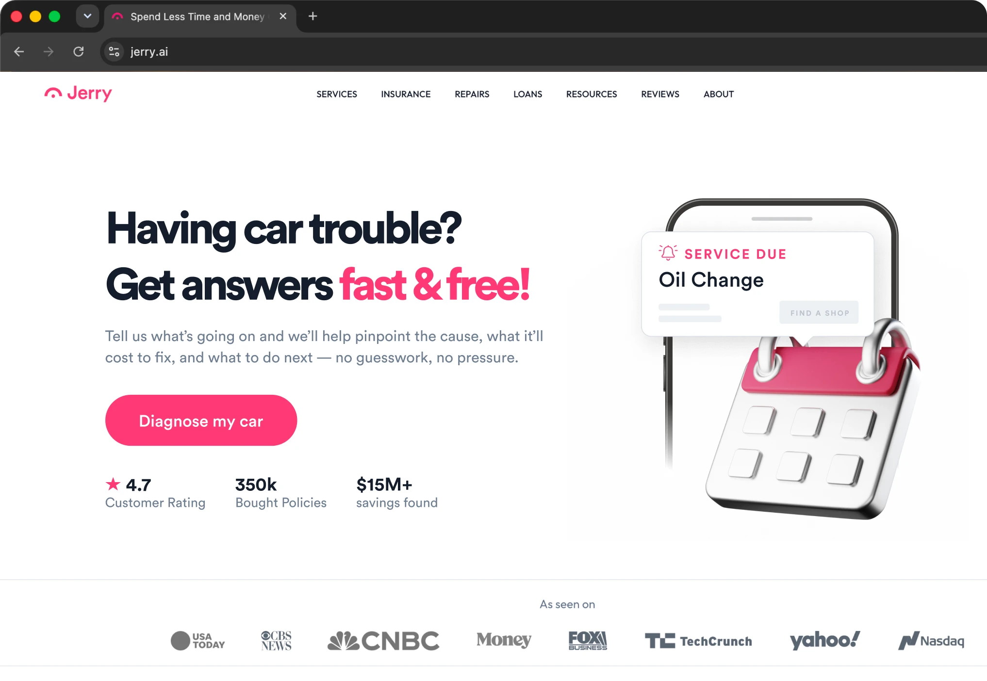
Diagnose was a high-intent growth lever hiding in plain sight — despite historic neglect.
Strong search + funnel metrics
Over 2M monthly queries for car symptoms, paired with outsized conversion from our existing LP, pointed to durable, low-CAC demand.
Promising engagement
Even with limited pathways and a subpar experience, Diagnose was opened more often than any other Garage tool — a clear signal of unmet user intent.
Resonant value prop
User interviews confirmed what the data suggested: people strongly resonated with symptom → diagnosis → cost clarity, and wanted a tool they could trust.
A natural onramp
Diagnose sat at the top of the maintenance and repair journey — the moment users first suspect something is wrong. That made it uniquely well-positioned to drive discovery and serve as an onramp to the broader ecosystem.
Audit
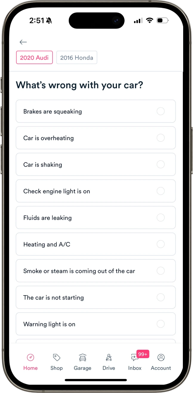
The existing diagnose experience was fraught with issues — leading to a lack of trust and low perceived utility.
Rigid, linear inputs
Forcing users to select from predefined sets of symptoms felt rigid and imprecise — causing users to have low trust in the results.
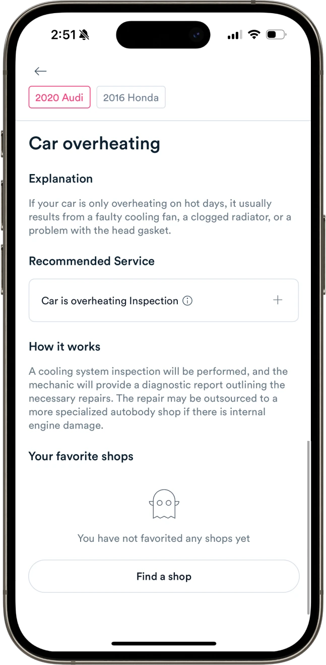
Shallow outputs
Diagnoses added little value compared to what they might get from a search engine. No indication of rationale or urgency inspired little trust in the result.
Limited actionability
Despite catching users in a moment of high intent, poor integration made it difficult to take any subsequent action on their results.
The mandate was clear: users were arriving in a moment of high intent, with a real problem to solve, but the current experience was failing to meet them there.
We saw an opportunity to do two things at once: rebuild Diagnose into a useful, trustworthy tool in its own right, and use its position upstream of so many repair journeys to test a broader hypothesis—that connecting Garage’s tools could help users take action while serving as a force multiplier for engagement by driving feature discovery and adoption.
It sort of feels like a BuzzFeed quiz. I don’t think I’d put too much faith in these results.
Product vision
Give users a path to navigate car issues with clarity & confidence — and a natural gateway to the broader product ecosystem.
Prototyping
Building & testing with mechanics in the loop
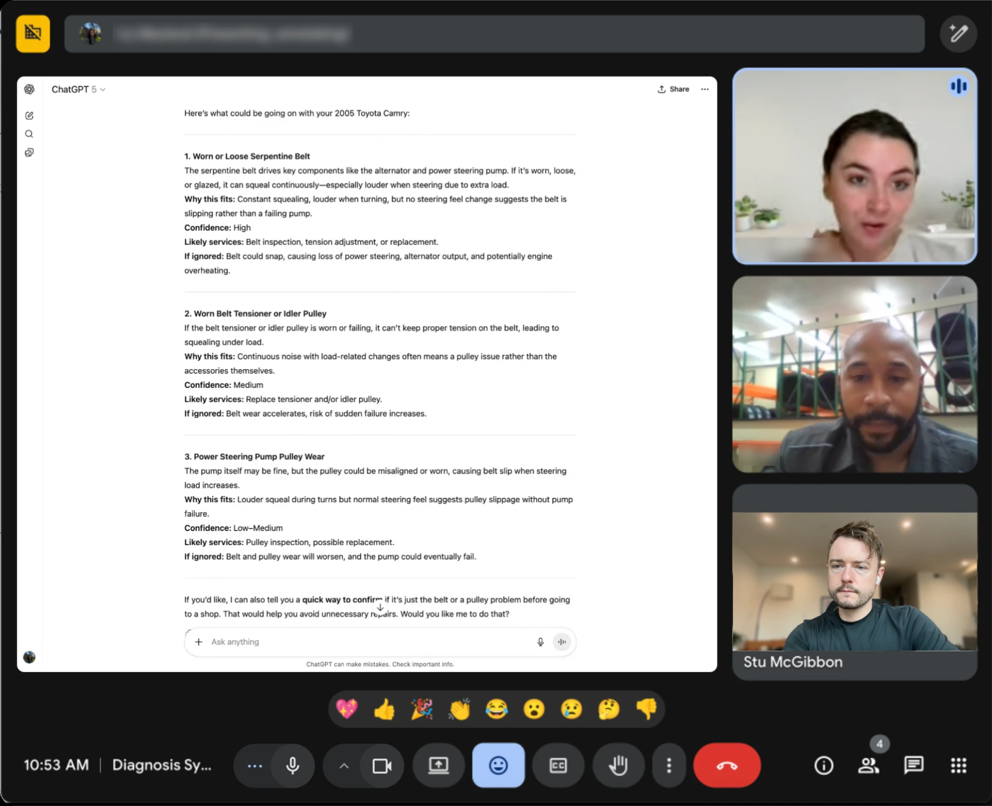
In parallel with user research, we began developing a proof-of-concept diagnostic model with licensed mechanics. Before committing to the direction, we needed to establish whether it could reliably interpret freeform descriptions, narrow down likely causes through follow-up questions, and map them to known issues.
Working through real cases with mechanics let us pressure-test the model and refine it in real time. Just as importantly, it gave us a clearer picture of what a credible diagnosis actually required, and where the tool’s responsibility needed to end.
Calibrating uncertainty
Many symptoms pointed to multiple plausible causes, even when the model sounded certain. Ranked diagnoses and confidence indicators emerged from these sessions as ways to communicate uncertainty more honestly.
Show your work
When mechanics were confident in a diagnosis, they could explain why. We wanted the model to do the same, grounding its conclusions in the symptoms and reasoning behind them.
Knowing when to escalate
Some issues called for immediate professional attention, not another diagnosis. Mechanics helped define the boundaries between what the tool could responsibly handle and when users needed a professional.
Early model performance was consistent and promising, but it was clear that translating that into a safe, reliable product would require clear guardrails and a good deal of structure.
Design principles
Our discovery work pointed towards a set of principles that would inform prioritization and shape our design decisions moving forward.

Approachable
What could feel open-ended or intimidating should feel easy to start and natural to continue. Reduce friction, maintain momentum, and make progress feel effortless.

Adaptive
Balance guardrails vs. flexibility. Users should always know what to do next, while still being able to steer the interaction meaningfully.

Trustworthy
Trust is built through transparency and nuance. Be clear about confidence, limitations, and rationale.

Actionable
Make insight operational. Every diagnosis should point to a concrete next step within the Garage ecosystem.
Concepts
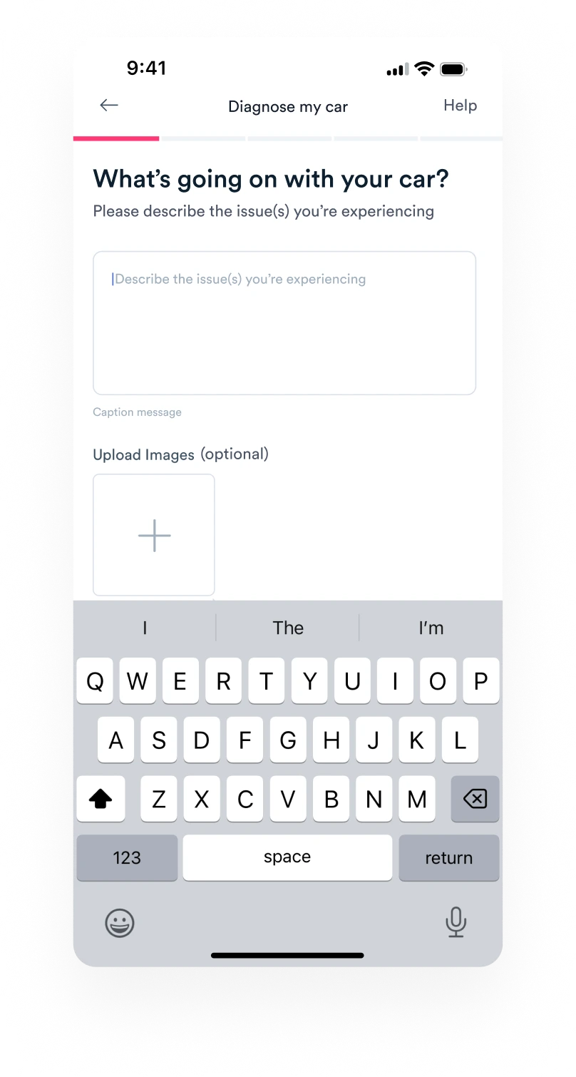
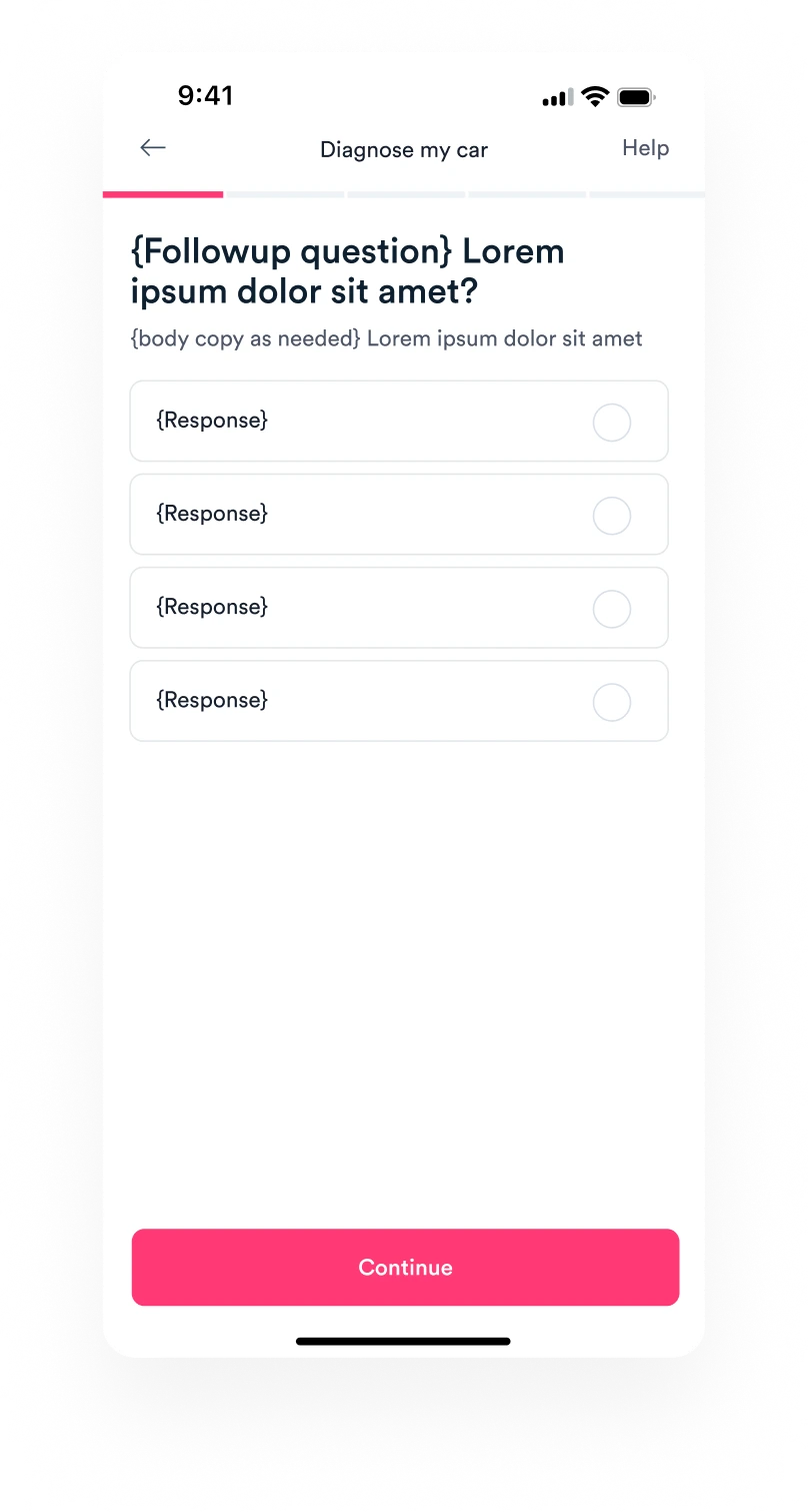
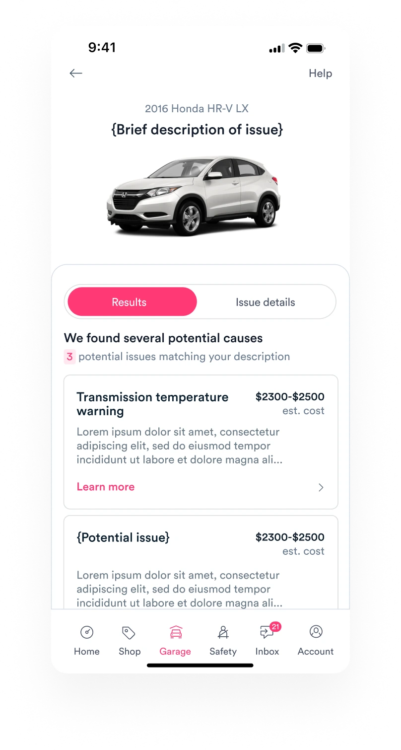
Coming out of discovery we knew the demand was real and the open-ended input was technically possible. What was still open was how to package that capability. We designed and tested lightweight prototypes on a spectrum — pressure-testing the MVP against a more ambitious direction.
Form-based
An on-rails flow with an adaptive backend — offering users the same opportunity for open-ended input in a more conventional container.
Describe your issue
Followup Q’s as needed
Results
Pros
- High predictability & control
- “Safer,” more familiar interaction model
- Low eng / design lift — easily built with existing components + infra
Cons
- More rigid inputs = less room for error recovery or rerouting
- Perceived wait times are longer for load vs. “typing”
- Shallow sense of intelligence — even with the same backend, users consistently underestimated the tool
Conversational
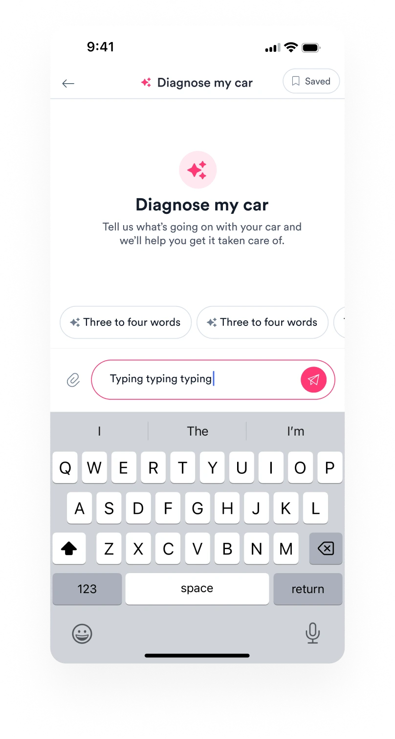
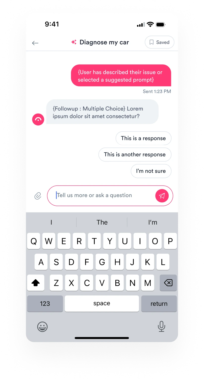
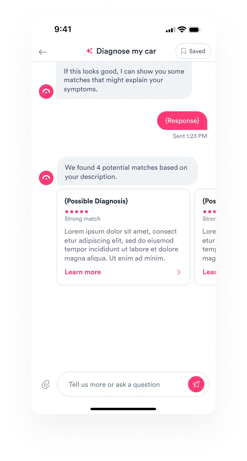
The same diagnostic model couched in a conversational UI where intake, results, and next steps are supported in a single surface.
Describe your issue
Followup Q’s as needed
Results
Pros
- More extensible foundation for future integrations
- Handles nuance and ambiguity more naturally
- Session state is preserved — easier pause, resume, revisit
Cons
- Higher perceived learning curve for a broad, non-technical user base
- More flexibility = edge cases, stronger guardrails + prompt engineering needed
- Greater design + engineering complexity
The form was the safer, simpler option, but testing exposed a fundamental mismatch: even with the same diagnostic capabilities, users consistently underestimated what it could do. Conversation was a more natural fit, giving users more freedom to describe their issues, respond to follow-ups, and steer the interaction. It meant taking on considerably more complexity, but we determined the tradeoff was well worth it.
User flow
Choosing conversation gave us a more flexible foundation, but introduced a new challenge: how to provide enough structure and guidance without sacrificing the freedom that made the approach compelling in the first place. To work through that tension, I mapped the experience into five phases, clarifying the job to be done and design priorities at each point in the flow.
- 1
Point of entry
Pique users' interest, align expectations, illustrate use cases, and invite interaction.
- 2
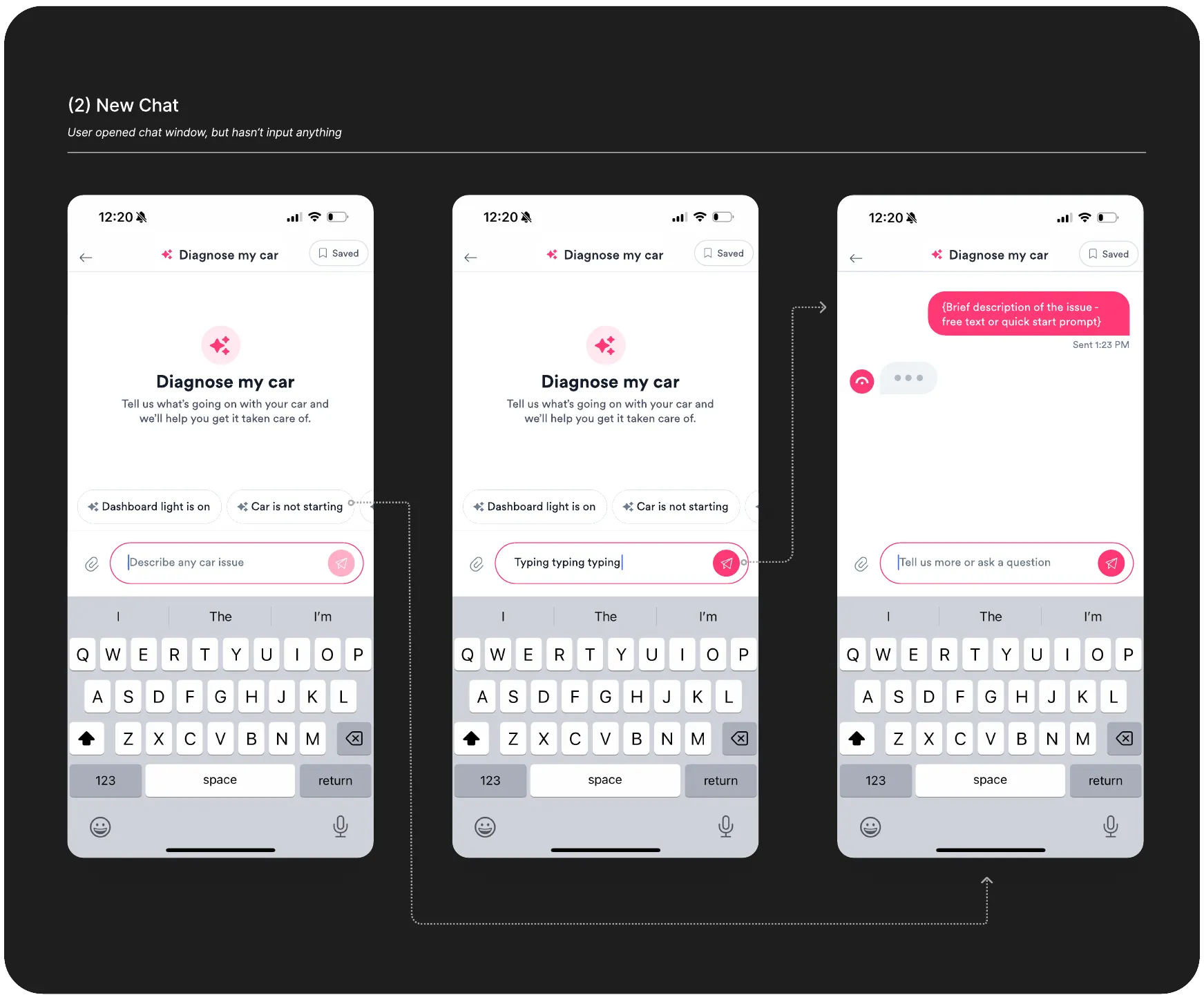
New chat
Onboard users to the tool, set expectations, illustrate use cases, capture initial symptom input.
- Expressive empty state
- Quick start prompts
- Free text input
- 3
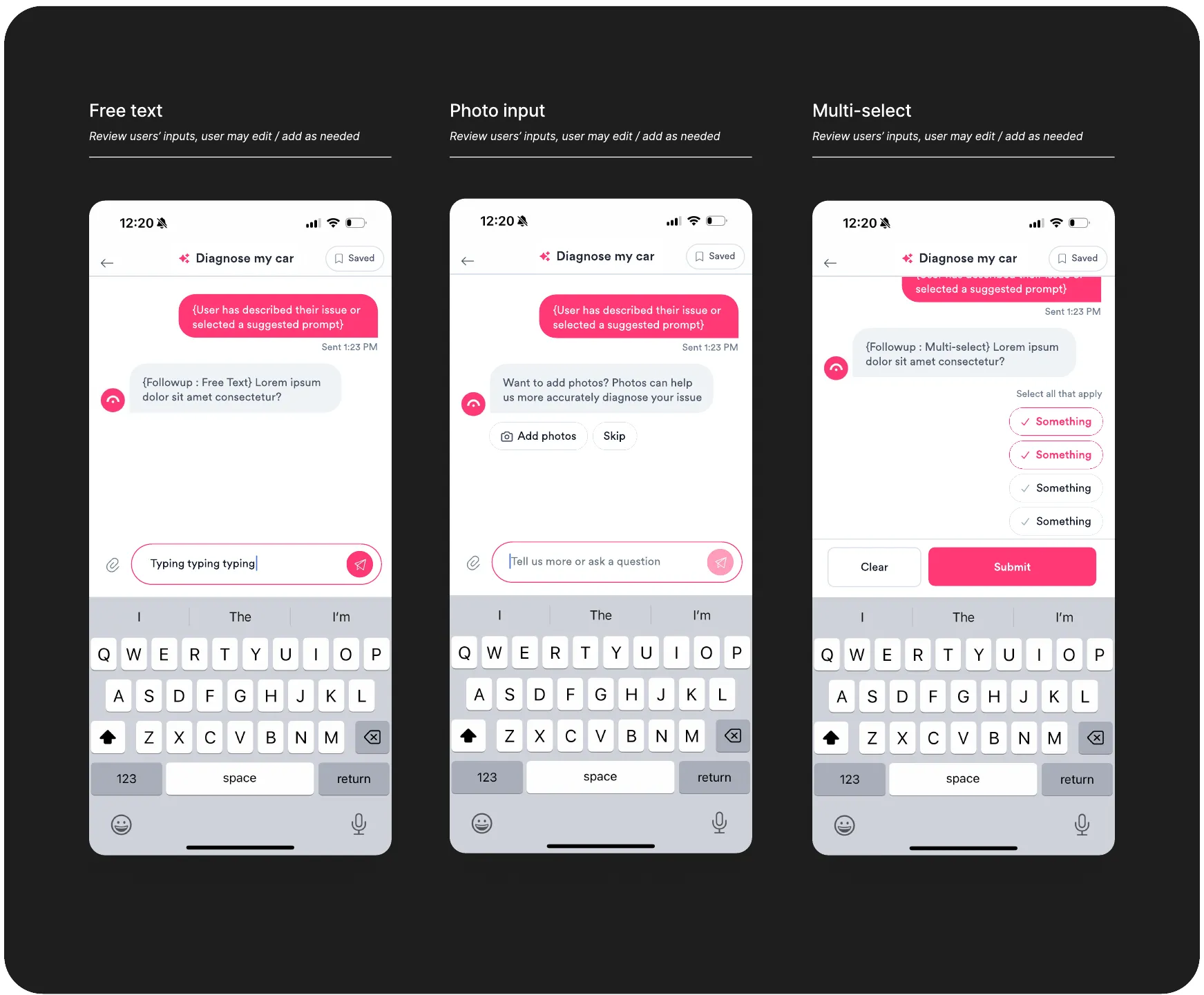
Core / Q&A
Gather user inputs through a series of adaptive follow-ups, a mix of structured + open-ended inputs...
- Multiple choice
- Free text input
- Photo / video / audio
- 4
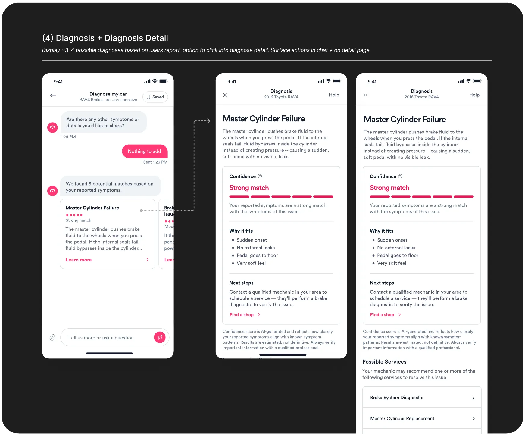
Diagnosis
Output a small set of likely diagnoses based on users’ inputs. Emphasis on utility, trust and transparency via...
- Confidence Score
- Evidence & Reasoning
- Recommended Actions
- Tests to narrow / validate
- 5
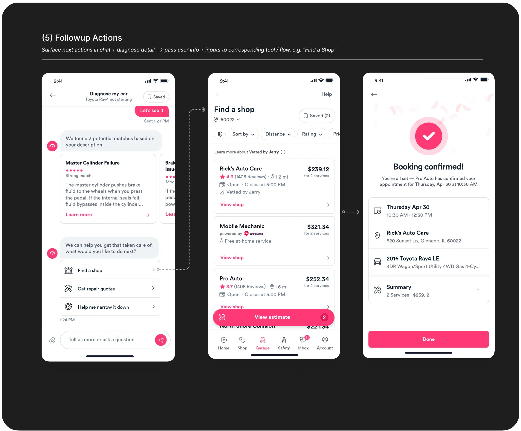
Action
Enable users to take action on their diagnosis, e.g.
- Get a cost estimate
- Find a shop
- Schedule service
- Follow-ups & revisions
- 1Point of Entry
- 2New Chat
- 3Core UX
- 4Output
- 5Action
Point of entry
The first touchpoint needed to provide a quick, approachable onramp to Diagnose, while priming users for success downstream through subtle instruction, affordances, and illustration of use cases.
New chat
Once users landed in Diagnose, our goal was to orient them quickly, reduce uncertainty, and guide them to express their problem clearly.
Core / followup
For the core information gathering phase, our primary task was to sustain momentum and build trust, while narrowing towards a likely diagnosis.
Our design process centered on achieving a balance between guardrails and flexibility, i.e. quick responses to reduce friction, a persistent free text input to preserve user control.
Diagnosis
Here, our goal was to present diagnoses in a way that built trust / credibility, felt accessible without being pedantic, and made them valuable as a standalone — while priming users to take action in the next step.
Actions
The final phase focused on bridging the gap from diagnose to the broader Garage ecosystem, making it seamless for users to take meaningful action on their results, and driving feature discovery + adoption in the process.
Point of entry
The first touchpoint needed to provide a quick, approachable onramp to Diagnose, while priming users for success downstream through subtle instruction, affordances, and illustration of use cases.
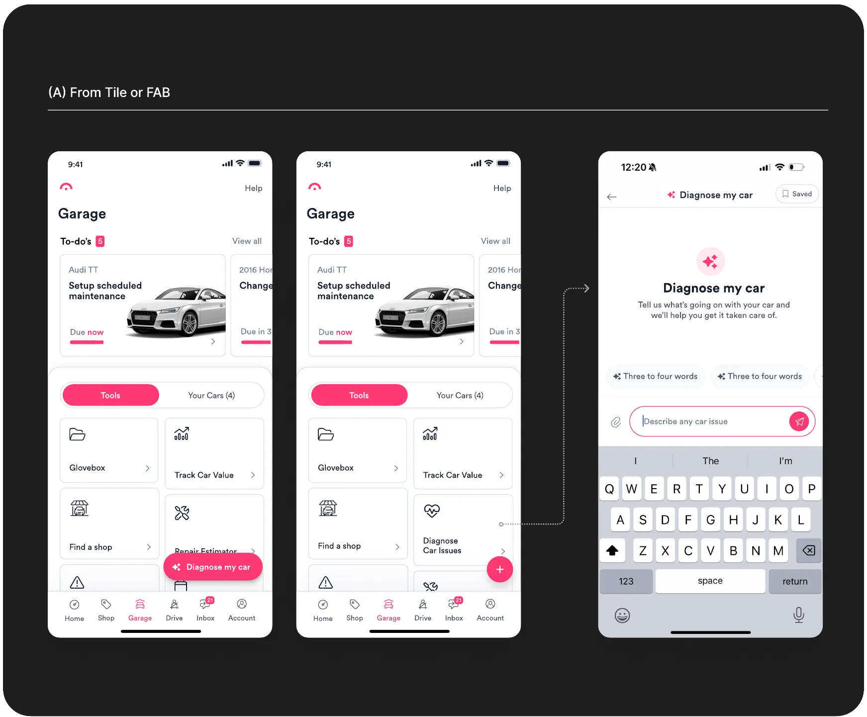
New chat
Once users landed in Diagnose, our goal was to orient them quickly, reduce uncertainty, and guide them to express their problem clearly.
Core / followup
For the core information gathering phase, our primary task was to sustain momentum and build trust, while narrowing towards a likely diagnosis.
Our design process centered on achieving a balance between guardrails and flexibility, i.e. quick responses to reduce friction, a persistent free text input to preserve user control.
Diagnosis
Here, our goal was to present diagnoses in a way that built trust / credibility, felt accessible without being pedantic, and made them valuable as a standalone — while priming users to take action in the next step.
Actions
The final phase focused on bridging the gap from diagnose to the broader Garage ecosystem, making it seamless for users to take meaningful action on their results, and driving feature discovery + adoption in the process.
Impact
Diagnose v1 launched as an A/B test alongside the broader redesign of core garage features — with strong signals for discovery, engagement, retention.
What shipped
- Free-text intake + empty state primer
- Intake components + design patterns
- Diagnosis detail page (template + structure)
- Integration w/ Shop Finder, Estimates
- Chat history + saved chats
- Redesigned: Shop Finder, Estimates, Recalls, Car Value Tracker, Quoting, Appointment Booking
On the horizon
- Deeper integration w/ Garage, in-chat support for shop discovery, scheduling, claims
- Garage home + IA redesign (tool-centric → vehicle-centric)
What we’ve measured (so far)
Initial results from the Diagnose launch — paired with the Garage redesign — show stronger completion, strong signals for feature adoption, and increased engagement across the app.
Of users who reached a diagnosis, nearly half went on to find a shop, get an estimate, or book a repair — a strong early signal that the bridge to the ecosystem is working.
Month-1 retention climbed from 14.7% to 22.1% across the Garage redesign period — suggesting that a more useful, integrated product keeps users coming back.
Active Garage sessions grew from 94K to 179K between February and August — a broad signal that the redesign is driving meaningful engagement across the product.
See also
All projects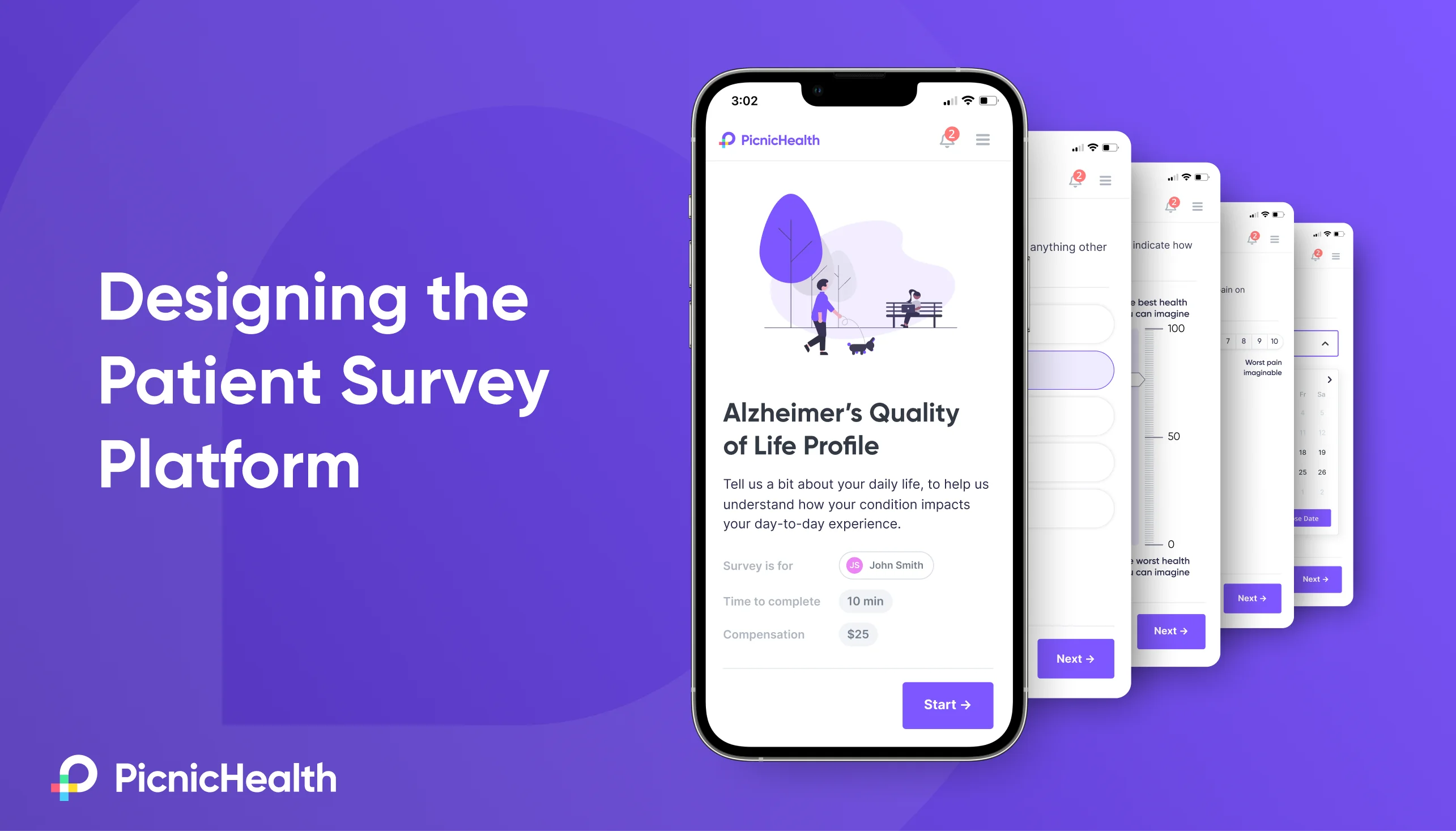
 PicnicHealth
: PROs
Led design for PicnicHealth's patient survey platform, including user research, product strategy, producing interaction and visual designs, and prototyping.
 PicnicHealth
: SCOPE
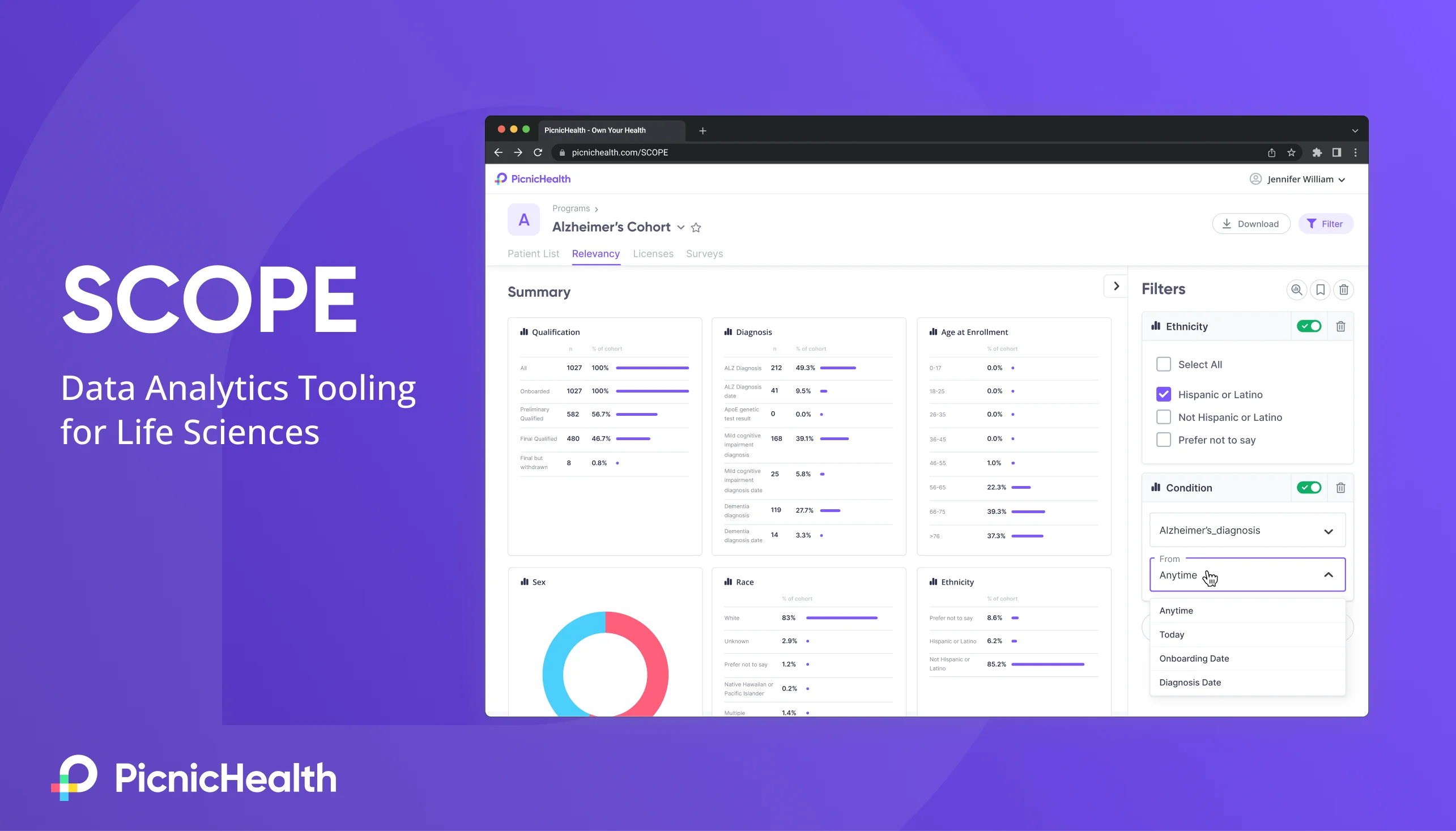
Launched PicnicHealth's first enterprise application — a self-service data analytics platform — including UX research, prototyping, UX/UI design, and data visualization.